SVG에 대해서 3
2025. 8. 25. 20:51ㆍit
목차
텍스트
- 기본 글자 쓰기
- 곡선을 따라 글자 쓰기
- 텍스트 부분 스타일링 적용하기
효과
- 그라디언트
- 패턴 1 - 패턴의 기본적인 사용법
- 패턴 2 - 애니메이션이 적용된 일러스트 패턴
[텍스트] 기본 글자 쓰기
텍스트는 '<text>' 태그를 사용한다.
<head>
    <style>
        .svg {
          position: absolute;
          width: 100%;
          height: 100%;
          background: #ddd;
        }
    </style>
</head>
<body>
    <svg class="svg" xmlns="http://www.w3.org/2000/svg">
      <text x="20" y="50">Hello, SVG!</text>
    </svg>
</body>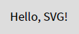
설명
- text의 x속성과 y속성
<text x="50" y="100">Hello</text>- x : 텍스트 시작점의 가로 좌표 (왼쪽에서 얼마나 떨어져 있는지).
- y : 텍스트 시작점의 세로 좌표 (위에서 얼마나 떨어져 있는지).
- 단, y 값은 글자의 baseline을 기준으로 한다.
- (예시) SVG 좌표계에서 (50, 100) 지점부터 "Hello"라는 텍스트가 그려진다.
- 쉽게 말해서 svg 부모 요소 positoin:relative;기준으로
text 요소 positon: absolute의 x 좌표와 y좌표를 설정하는 것과 같다.
- text 의 색 설정은 color 속성이 아닌, fill 속성을 사용.
<head>
    <style>
        .svg {
          position: absolute;
          width: 100%;
          height: 100%;
          background: #ddd;
        }
        text {
          font-size: 1.5rem;
          font-weight: bold;
          fill: green; /* 텍스트의 색을 변경하고 싶다면, color가 아닌, fill을 사용. */
        }
    </style>
</head>
<body>
    <svg class="svg" xmlns="http://www.w3.org/2000/svg">
      <text x="20" y="50">Hello, SVG!</text>
    </svg>
</body>
[텍스트] 곡선을 따라 글자 쓰기
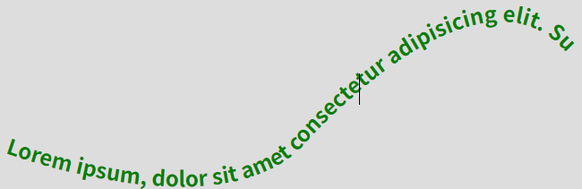
<defs>, <textPath> 라는 요소를 사용하면, <path> 요소와 <text>요소를 활용하여 곡선을 따라 배치되는 글자를 만들 수 있다.
<defs> 란?
- definitions(정의)의 줄임말.
- 재사용할 그래픽 객체나 리소스를 정의하는 영역.
- 실제 화면에 바로 렌더링되지 않음.
- 안에 정의한 요소들은 이후에 <use>, fill="url(#id)", clip-path="url(#id)" 같은 방식으로 불러와서 사용할 수 있음.
- SVG 문서 안에서 템플릿 같은 역할을 한다고 보면 됨.
<textPath> 란?
- 텍스트를 특정 경로(Path)에 따라 흐르도록 표시할 때 사용.
- <path> 요소로 만든 곡선이나 도형의 라인을 따라 글자를 배치.
- <text> 요소 내부에서 사용됨.
- <textPath>의 xlink:href (최근에는 href) 속성을 이용해, 미리 정의된 <path> 요소의 id를 참조함.
- 글자가 지정한 경로에 따라 휘어지거나 원형으로 배치됨.
예시 코드
<head>
    <style>
        .svg {
          position: absolute;
          width: 100%;
          height: 100%;
          background: #ddd;
        }
        text {
          font-size: 1.5rem;
          font-weight: bold;
          fill: green;
        }
        path {
          stroke: red;
          fill: transparent;
        }
    </style>
</head>
<body>
    <svg class="svg" xmlns="http://www.w3.org/2000/svg">
      <defs>
          <path id="text-curve" d="M 50 400 C 50 400, 300 500,
          400 400 C 400 400, 600 170, 700 300"></path>
      </defs>
      <text x="20" y="50">
        <textPath href="#text-curve">
        Lorem ipsum, dolor sit amet consectetur adipisicing elit.
        Sunt consequuntur modi quia cupiditate dignissimos!
        </textPath>
      </text>
    </svg>
</body>- 곡선을 따라 글자를 렌더링 하려면,
path를 참조하여 text를 그려야 하기 때문에 defs안에 path를 작성한다. - path에 id 값을 부여하고, textPath안에 글자를 작성한뒤 href 속성으로 path id 값을 연결한다.
[텍스트] 텍스트 부분 스타일링 적용하기
HTML에서 <span>이 텍스트 일부를 감싸 스타일을 다르게 적용하듯이, SVG에서는 <tspan>이 같은 역할을 한다.
<tspan> 란?
- 텍스트(text) 안에서 부분적으로 스타일을 바꾸거나 위치를 제어할 때 쓰는 태그.
- <text> 안에서 텍스트를 조각내어 개별적으로 제어할 수 있음.
- 글자 크기, 색상, 위치(x, y, dx, dy 등)를 각각 다르게 설정 가능.
- 여러 줄 텍스트를 만들 때도 자주 사용됨.
예시 코드
<head>
    <style>
        .svg {
          position: absolute;
          width: 100%;
          height: 100%;
          background: #ddd;
        }
        text {
          font-size: 1.5rem;
          font-weight: bold;
          fill: green;
        }
        path {
          stroke: red;
          fill: transparent;
        }
        .point {
          fill: red;
        }
    </style>
</head>
<body>
    <svg class="svg" xmlns="http://www.w3.org/2000/svg">
      <defs>
          <path id="text-curve" d="M 50 400 C 50 400, 300 500,
          400 400 C 400 400, 600 170, 700 300"></path>
      </defs>
      <text x="20" y="50">
        <textPath href="#text-curve">
        <tspan class="point">Lorem ipsum,</tspan> dolor sit amet consectetur adipisicing elit.
        Sunt consequuntur modi quia cupiditate dignissimos!
        </textPath>
      </text>
    </svg>
</body>

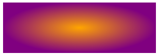
[효과] 그라디언트
svg에서 그라디언트를 만들려면 <defs>안 에 <linearGradient>와 <stop>을 정의하여 사용한다.
<linearGradient> 란?
- 선형으로 색이 점진적으로 변하는 그라디언트를 정의하는 태그.
- <defs> 안에 정의해 두고, fill="url(#id)" 또는 stroke="url(#id)" 방식으로 적용.
- 좌표(x1, y1, x2, y2)로 그라디언트의 방향을 지정합니다.
예: 왼쪽 → 오른쪽, 위 → 아래, 대각선 방향 등.
<radialGradient> 란?
- 원형 그라디언트.
<stop> 란?
- 그라디언트의 색 전환 지점(스탑 포인트)을 정의.
- offset으로 위치를 정하고, stop-color와 stop-opacity로 색과 투명도를 설정.
- offset : 색 전환 지점 (0% ~ 100% 또는 0 ~ 1).
- stop-color : 해당 위치의 색상.
- stop-opacity : 해당 위치의 투명도 (0 = 투명, 1 = 불투명).
예시 코드
<body>
    <svg width="300" height="100">
      <defs>
        <linearGradient id="gradHorizontal" x1="0%" y1="0%" x2="100%" y2="0%">
          <stop offset="0%" stop-color="orange"/>
          <stop offset="100%" stop-color="purple"/>
        </linearGradient>
        <style>
            <![CDATA[
            /* css로도 fill url을 넣을 수 있다. */
            /*
            .myGradient {
              fill: url('#gradHorizontal');
            }
            */
            ]]>
        </style>
      </defs>
      <rect class="myGradient" width="300" height="100" fill="url(#gradHorizontal)" />
</svg>
</body>

- <linearGradient> 를 <radialGradient> 로 바꾸면 그라디언트가 원형으로 들어간다.
[효과] 패턴 1 - 패턴의 기본적인 사용법
<pattern>은 패턴(무늬)을 정의해 놓고, 특정 도형의 채우기(fill)나 테두리(stroke)에 반복적으로 적용할 수 있도록 해주는 요소이다.
<pattern> 이란?
- <pattern>은 <defs> 안에 정의해 두고, id를 붙인다.
- 그 후 다른 도형에서 fill="url(#패턴ID)" 또는 stroke="url(#패턴ID)" 형식으로 불러와서 사용한다.
- 패턴은 타일처럼 반복되어 도형 전체를 채우게 됨.
- 주요 속성
- id : 패턴을 참조할 때 사용할 고유 식별자
- x, y : 패턴 시작 위치
- width, height : 패턴 타일의 크기
예시 코드
<head>
<style>
svg {
  width: 500px;
  height:500px;
  background: #ddd;
}
.pattern-circle {
  fill: blueviolet;
}
.bg-rect {
  fill: url(#bg-pattern);
}
</style>
</head>
<body>
<svg>
  <defs>
    <pattern id="bg-pattern" x="0" y="0" width="0.2" height="0.2">
      <circle cx="50" cy="50" r="50" class="pattern-circle"></circle>
    </pattern>
  </defs>

  <rect class="bg-rect" x='0' y='0' width="100%" height="100%"></rect>
</svg>
</body>
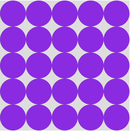
설명
- width="0.2", height="0.2" : 대상 도형(여기서는 <rect>) 너비, 폭의 20% 로 설정.
- fill: url(#bg-pattern) : 대상 도형에 fill속성으로 pattern 요소를 설정하면 패턴이 들어감.
반응형으로 하려면?
- svg에 viewBox를 사용한다.
- 패턴 간의 거리는 svg의 viewBox의 값을 고려하여,
<pattern>의 width, height의 비율을 조절하거나, 패턴안에 들어가는 요소(도형)의 크기를 조절한다.
예시 코드
<head>
<style>
svg {
  position: absolute;
  left: 0;
  top: 0;
  width: 100%;
  height: 100%;
  background: #ddd;
}
.pattern-circle {
  fill: blueviolet;
}
.bg-rect {
  fill: url(#bg-pattern);
}
</style>
</head>
<body>
<svg viewBox="0 0 500 500">
  <defs>
    <pattern id="bg-pattern" x="0" y="0" width="0.2" height="0.2">
      <circle cx="50" cy="50" r="50" class="pattern-circle"></circle>
    </pattern>
  </defs>

  <rect class="bg-rect" x='0' y='0' width="100%" height="100%"></rect>
</svg>
</body>
[효과] 패턴 2 - 애니메이션이 적용된 일러스트 패턴
- svg를 css로 일반 html태그에 패턴을 설정할 수 있다.
- 일반 html요소에 css의 background 이미지로 svg 파일을 넣었지만,
그 svg 안에 css로 keyframe을 넣으면 움직이는 이미지 패턴으로 만들 수 있다.
<!-- test.svg -->
<svg xmlns="http://www.w3.org/2000/svg" width="400" height="400" style="background:#ddd">
  <defs>
    <style>
      <![CDATA[
      .pattern-circle {
        fill: orange;
        transform-origin: center;
        animation: pulse 2s infinite alternate;
      }
      @keyframes pulse {
        0%   { transform: scale(1); fill: orange; }
        100% { transform: scale(1.5); fill: tomato; }
      }
      ]]>
    </style>
    <!-- userSpaceOnUse 로 좌표계 고정 -->
    <pattern id="bg-pattern" x="0" y="0" width="100" height="100" patternUnits="userSpaceOnUse">
      <circle class="pattern-circle" cx="50" cy="50" r="20"/>
    </pattern>
  </defs>

  <rect width="100%" height="100%" fill="url(#bg-pattern)" />
</svg>

<!-- ... -->

<head>
    <style>
    .box1 {
      background: url(images/test.svg);
    }
    </style>
</head>
<body>
    <div class="box1"></div>
</body>
'it' 카테고리의 다른 글
| YAML 이란? (1) | 2026.01.05 |
|---|---|
| Chrome 브라우저에서 User-agent 변경하기 (1) | 2025.11.17 |
| SVG에 대해서 2 (5) | 2025.08.10 |
| SVG에 대해서 1 (5) | 2025.07.29 |
| robots.txt에 대하여 (0) | 2025.07.13 |